The Project
Background
This case study was developed for academic purposes as part of my Master’s in UX Design program at MICA. The project focused on enhancing the Spotify search experience for Premium users.
roles and responsabilities
This project was a comprehensive solo exploration, wherein I took responsibility for every phase, from conducting user research via interviews and forums (Reddit), to creating wireframes and prototypes, conducting multiple rounds of usability testing, and determining the overall design direction.
SCOPE OF SERVICES
User Research and Analysis Interface Design Accessibility Assessment Usability Testing and IterationDisclaimer: This project was done in an academic setting with no affiliation to Spotify.THE OBJECTIVE
-
The primary objective was to optimize Spotify's search engine by refining content curation and presentation to cater specifically to the needs of Premium users.
How might we streamline Spotify's search process for Premium users, ensuring quicker access to their preferred content?
-
1. Investigate the search process for Mood Playlists among Spotify Premium users to discern their preferences and evaluate the ease of finding relevant content.
2. Assess the layout and visibility of Mood Playlist Categories within the current prototype interface to determine if it meets users' needs and enhances their experience.
3. Evaluate the effectiveness of the new Niche music sections in facilitating the discovery of niche artists for Premium users, considering ease of access and relevance of categories.
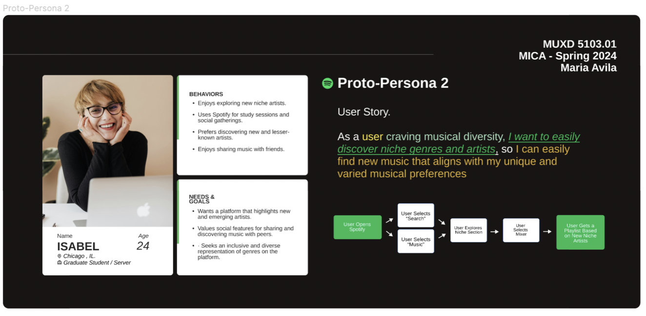
THE PERSONAS
A Challenge I Faced
One of the most challenging design problems encountered during the research phase of the Spotify project was the need to consider the app's recent redesign launched in the summer of 2023. Previous attempts by UX developers to address this issue had overlooked this crucial context. To gather relevant, fresh data on user issues, I innovatively conducted a survey on Reddit's r/spotify, which provided valuable insight into user habits and preferences, informing the creation of a more effective information architecture.
my approach
The process began with initial user interviews to determine how users interact with the Spotify app. I then moved into the ideation phase, utilizing brainstorming methods such as Crazy 8’s and Lightning Sketches to quickly iterate different concepts.
After narrowing down concepts from the sketching phase, I translated them into low-fidelity wireframes. Subsequently, I developed a functioning prototype and incorporated the platform's branding. Upon creating the prototype, I conducted three rounds of usability tests, with five participants in each round, to identify any lingering pain points before revising the final prototype.
design deliverables
DESIGN SYSTEM
I created a design system to leverage the existing design components, fonts, and layouts, ensuring immediate brand recognition.
interactive banners
The following banners were included on the Prototype to not only visually attract users to the new features being tested, but also to help them navigate the user flow.
Small Banner: Implemented on the Home Screen
Medium Size Banners: Implemented on the "Music Screen" and "Search Screen"
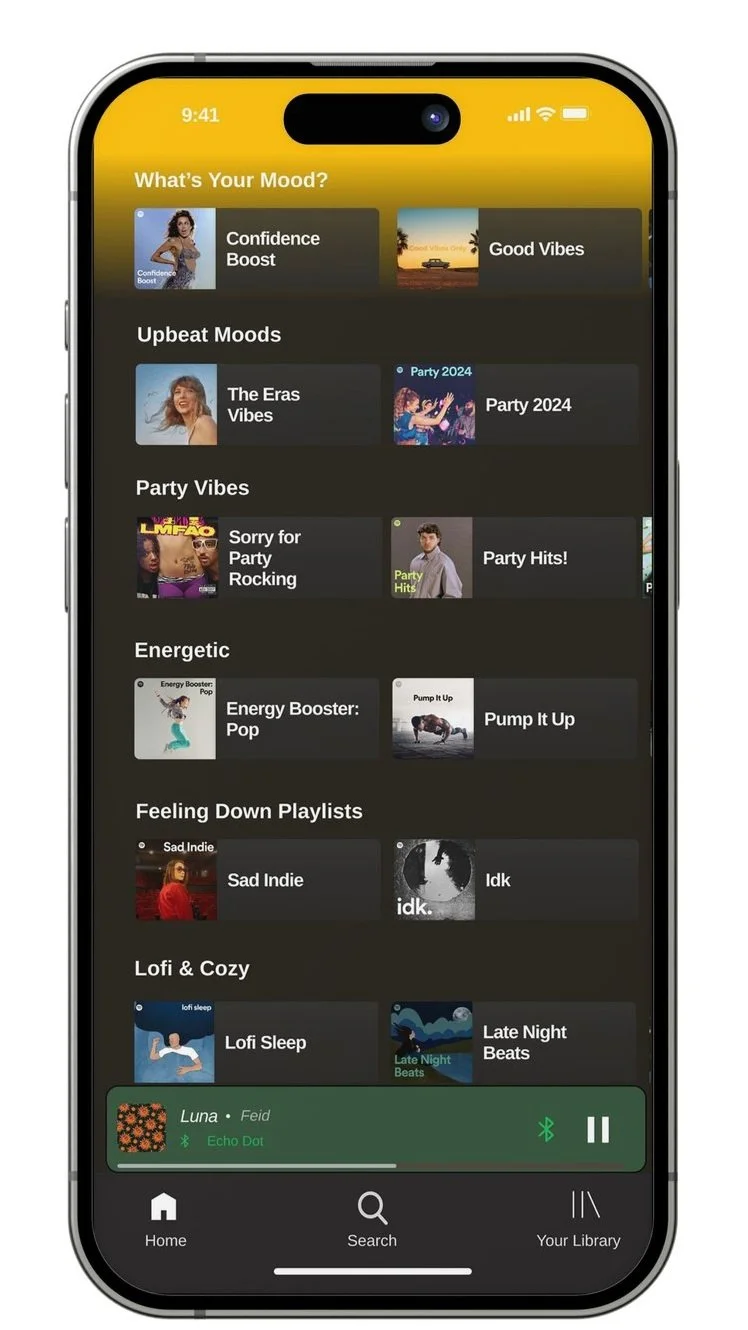
MOOD SECTION
Compelling, high-fidelity layout for the “Mood” Music Section.
Users Top Playlists: Implemented on the top of the section for easy access. The overflow of the content can be seen by horizontal scrolling.
All categories have 6 or more Playlists for users, the behavior of these sections is to allow Horizontal Scroll for the overflow.
Dailylist: Implemented on the section per users request during the second round of usability test. This is an “algorithmically-curated playlists, regularly updated to collect "the niche music and microgenres you usually listen to during particular moments in the day or on specific days of the week”. (Spotify, 2024)
niche SECTION
Compelling, high-fidelity layout for the “niche” Music Section.
Creating a Niche Section on Spotify for Enhanced User Experience
This section was meticulously crafted to cater to the diverse tastes and preferences of music enthusiasts, ensuring that every user can discover content that resonates with them on a deeper level.
The creation of this niche section involved a comprehensive analysis of user listening habits, genre preferences, and search patterns. By leveraging a series of usability testings, I was able to identify distinct elements that would make this section stand out.
subcategories:
pills with Top users genres
your unique playlist:
This New Feature allows users to find New Artist and blend Genres.top trending niche artists
playlists mixed by you
5. browse niche genres
6. browse all niche genres
NEW NICHE ARTISTS MIXER
This innovative tool allows users to select three or more artists of their choice before hitting 'Done.' Once the selection is made, Spotify works its magic by curating a custom playlist that seamlessly blends the influences of the chosen artists. This interactive and engaging experience offers users a visually engaging way to create a Playlist.
The Playlist Mixer not only serves as a practical tool for users to explore new music but also showcases my commitment an UX Designer to creating a seamless and personalized listening experience.
the outcome
Top-level insights:
1. The development of the Mood Playlist Page during Flow 1 received positive feedback and was highlighted as an improvement in navigation and user experience.
2. Users appreciated the organized layout and easy access to niche artists in the Flow 2 section, suggesting it enhanced content discovery and personalization..
mood section
Observations: Users expressed a preference for a compact layout with easy access to mixes.
Insight/Pattern: Users found the Mood Playlist Page design intuitive and enjoyable, with a focus on curated content.
Quote:
"I like the organized layout and easy access to different moods without excessive scrolling.
niche section
Observations: Users found the presentation of niche artists clear and readable. There was an interest in exploring more niche genres, but users preferred a manageable number of options.
Insight: Users valued the accessibility and clarity of the niche artist section, enhancing their ability to discover new music.
Quote:
"The layout is clear, and I can easily explore different niche artists."
what did i learn?
Through my exploration of UX/UI design for Spotify, I gained valuable insights into the importance of conducting effective usability tests. Additionally, this project taught me the significance of delivering innovative solutions within established brand standards. While exploring new design ideas, I learned to strike a balance between creativity and brand consistency. By aligning my designs with Spotify's existing visual language and brand identity, I ensured that my concepts not only felt fresh and innovative but also maintained coherence with the overall Spotify experience.


